NWC Brand & Identity Guidelines
Unacceptable Logo Use
The following practices should be avoided when using the logo.
| The proportions of the art and type elements should not be modified. Any change in size must be done proportionally: | Color applications should not be changed or modified: | The logo should not be represented in a single color other than white or black on a colored background: |
 |
 |
 |
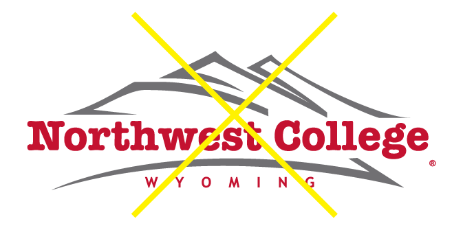
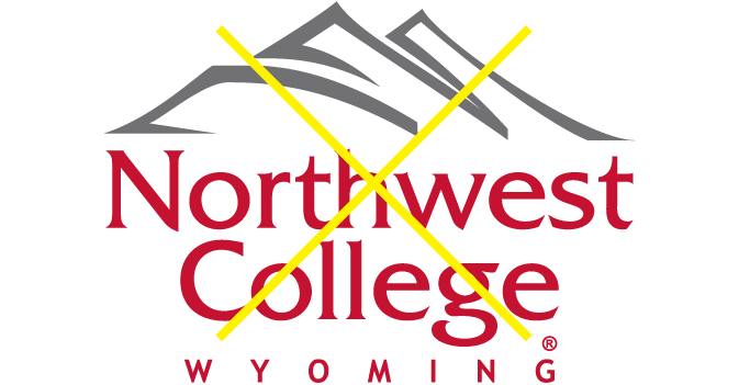
| The logo should not be distorted, stretched, squeezed or modified. Any change in size must be done proportionally: | Logo typefaces should not be changed: | Elements of the logo should not be rearranged, altered or removed: |
 |
 |
 |
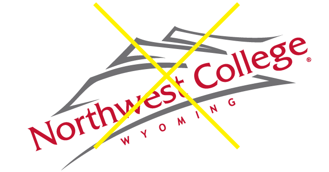
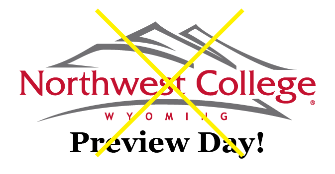
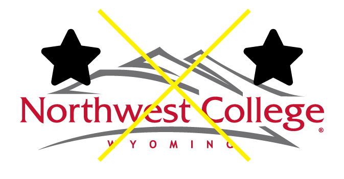
| The logo should not be tilted: | Do not add any other text elements with the logo: | Do not add other graphic elements to the logo: |
 |
 |
 |
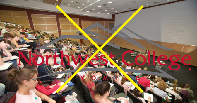
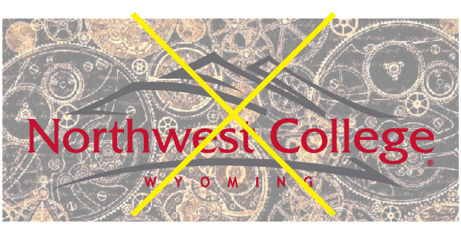
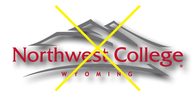
| Do not place the logo over the busy area within a photograph: | Do not place the logo over a busy graphic pattern: | Do not use a heavy drop shadow or any sort of emboss effect on the logo: |
 |
 |
 |
Contact
Carey Miller | Communications & Marketing Director | carey.miller@nwc.edu | 307-754-6114
- Make a Communications & Marketing Reservation online


